Simple data visualization
visualization.RmdIntroduction
R provides very powerful tools for data visualization, particularly
ggplot. This leads to a dilemma when teaching, however. Do
we first teach the basics or ggplot before
students can visualize their data, or do we use other simpler tools for
summarization and visualization, albeit of a limited kind, and later
teach more about the powerful ggplot tools? The
psyntur package aims to provide some tools if the latter
approach is taken. These functions aim to make it quick and easy to
perform the common kinds of data exploration and visualization. All
functions, however, are wrappers around sets of ggplot
commands In this vignette, we showcase some of these tools.
The required functions as well as some example psychological science
data sets can be loaded with the usual library command.
library(psyntur)Scatterplots
We can perform a standard 2d scatterplot with
scatterplot. For example, using the
faithfulfaces data provided by psyntur, we can
plot a scatterplot showing the relationship between the perceived
(sexual) faithfulness of a person in a photo against their perceived
trustworthiness as follows.
scatterplot(x = trustworthy, y = faithful, data = faithfulfaces)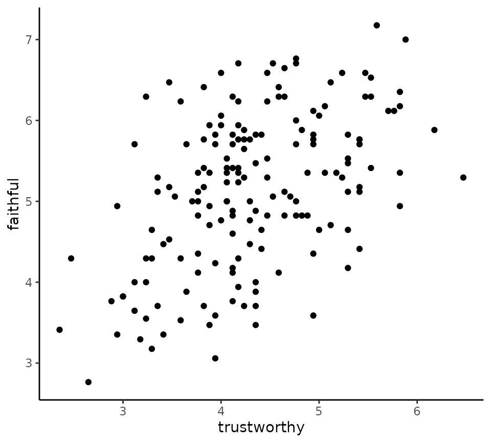
We can colour code the points according to the value of a third,
usually categorical variable, by using the by argument. For
example, here we colour code the points according to the sex of the
person in the photo.
scatterplot(x = trustworthy, y = faithful, data = faithfulfaces, by = face_sex)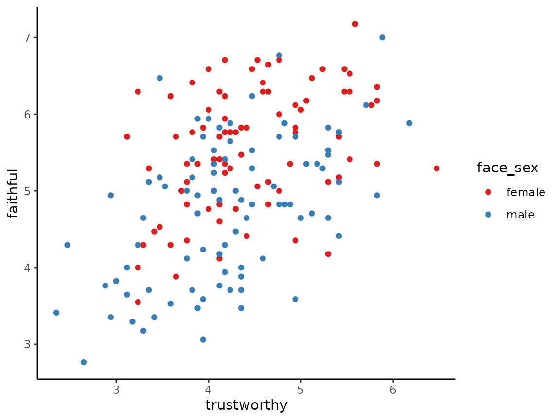
We can add the line of best fit to all points in the scatterplot, or
to each set of coloured points in the scatterplot if by is
used, with the best_fit_line argument.
scatterplot(x = trustworthy, y = faithful, data = faithfulfaces,
            by = face_sex, best_fit_line = TRUE)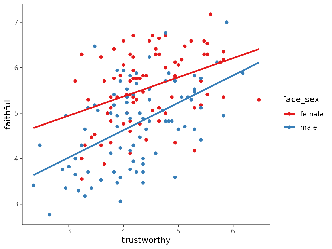
Boxplots
Boxplots, also known as box-and-whisker plots, or Tukey boxplots or
box-and-whisker plots, display the distributions of univariate data,
optionally grouped according to other variables. For example, to show a
boxplot of the distribution of all the response times in an experiment
that collected response times in different conditions, which is provided
by the vizverb data sets, we can do the following.
tukeyboxplot(y = time, data = vizverb)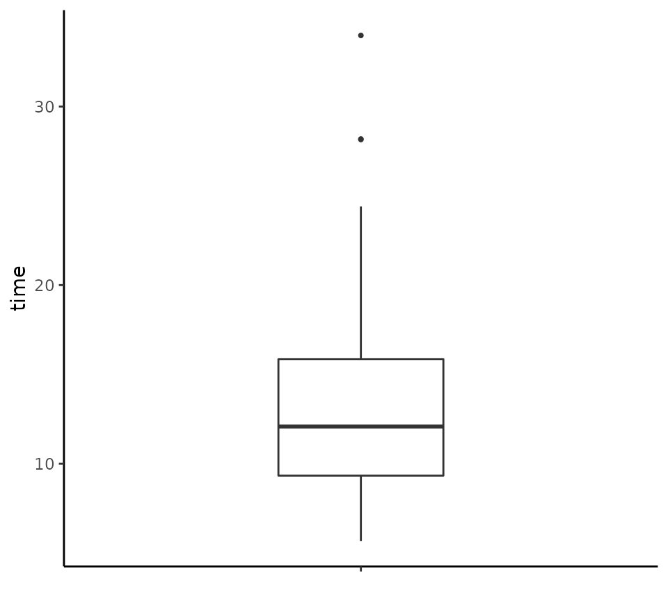
We can add all the points as jittered points as follows.
tukeyboxplot(y = time, data = vizverb, jitter = TRUE)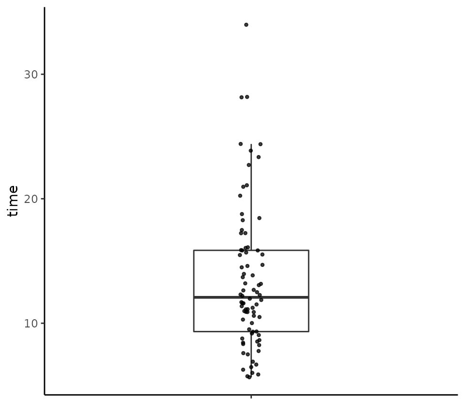
If we want to plot the distribution of time for each of
the two different tasks performed in the experiment, provide by the
task variable in vizverb, we can set the
x variable to task as follows.
tukeyboxplot(y = time, x= task, data = vizverb)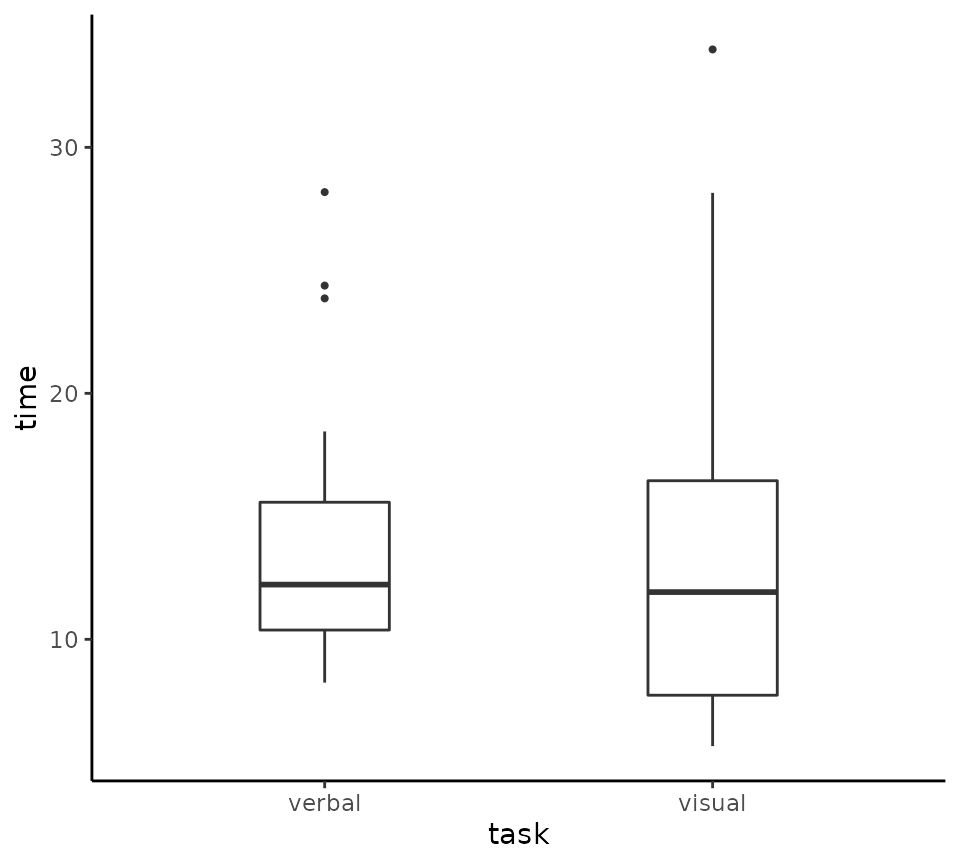
The vizverb data is from a two-way factorical experiment
where reaction times are collected for different tasks (the
task variable) and using different responses (the
response variable). We can plot the distribution of
time according to both task and
response by using x and by
together as follows.
tukeyboxplot(y = time, x= task, data = vizverb, by = response)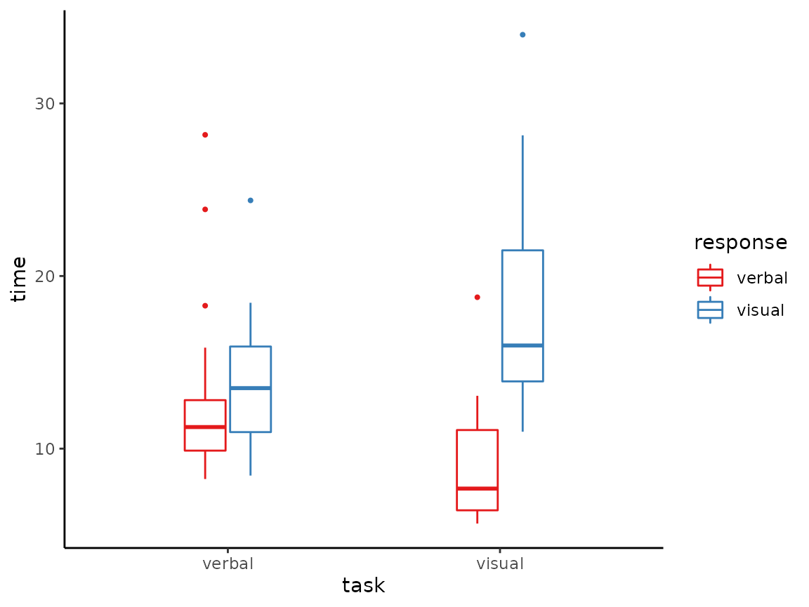
Jittered points can be put on these plots by using
jitter = TRUE.
tukeyboxplot(y = time, x= task, data = vizverb,
             by = response, jitter = TRUE)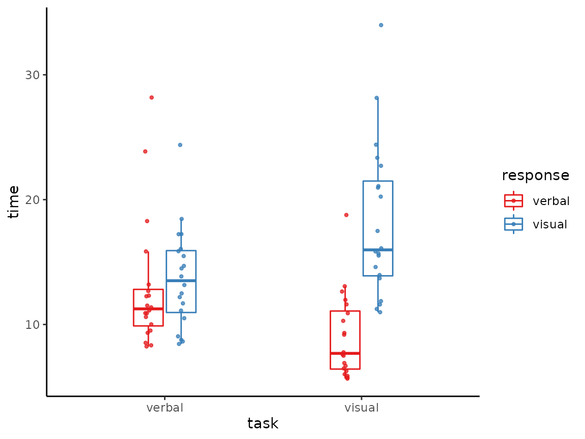
Continuous variables can be used as the x variable as in
the following example using the R built in ToothGrowth data
set.
tukeyboxplot(y = len, x = dose, data = ToothGrowth)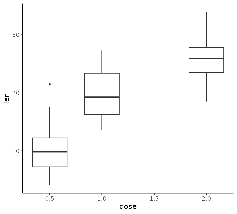
This can be used with by and jitter
too.
tukeyboxplot(y = len, x = dose, data = ToothGrowth,
             by = supp, jitter = TRUE, jitter_width = .5)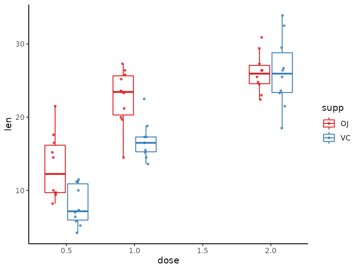
Histograms
Histograms can be made with the histrogram function. For
example, to plot the onset ages of schizophrenia, using the
schizophrenia data, we can do the following.
histogram(x = age, data = schizophrenia)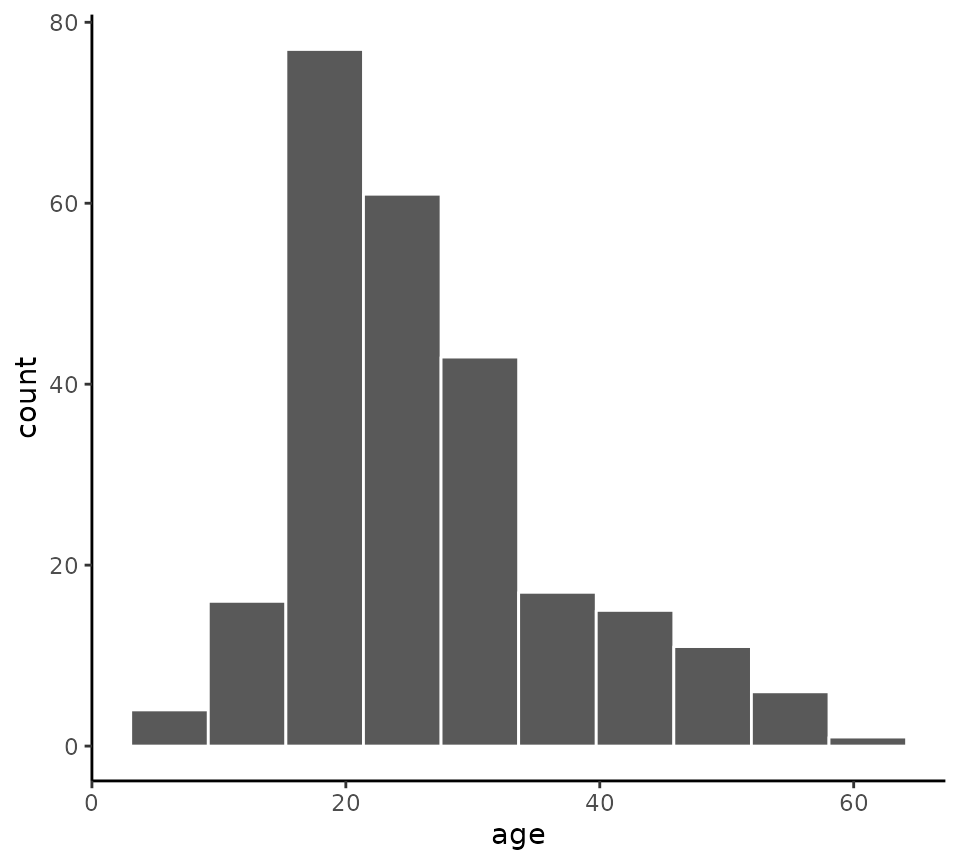
We can change the number of bins from its default of 10 with the
bins argument.
histogram(x = age, data = schizophrenia, bins = 20)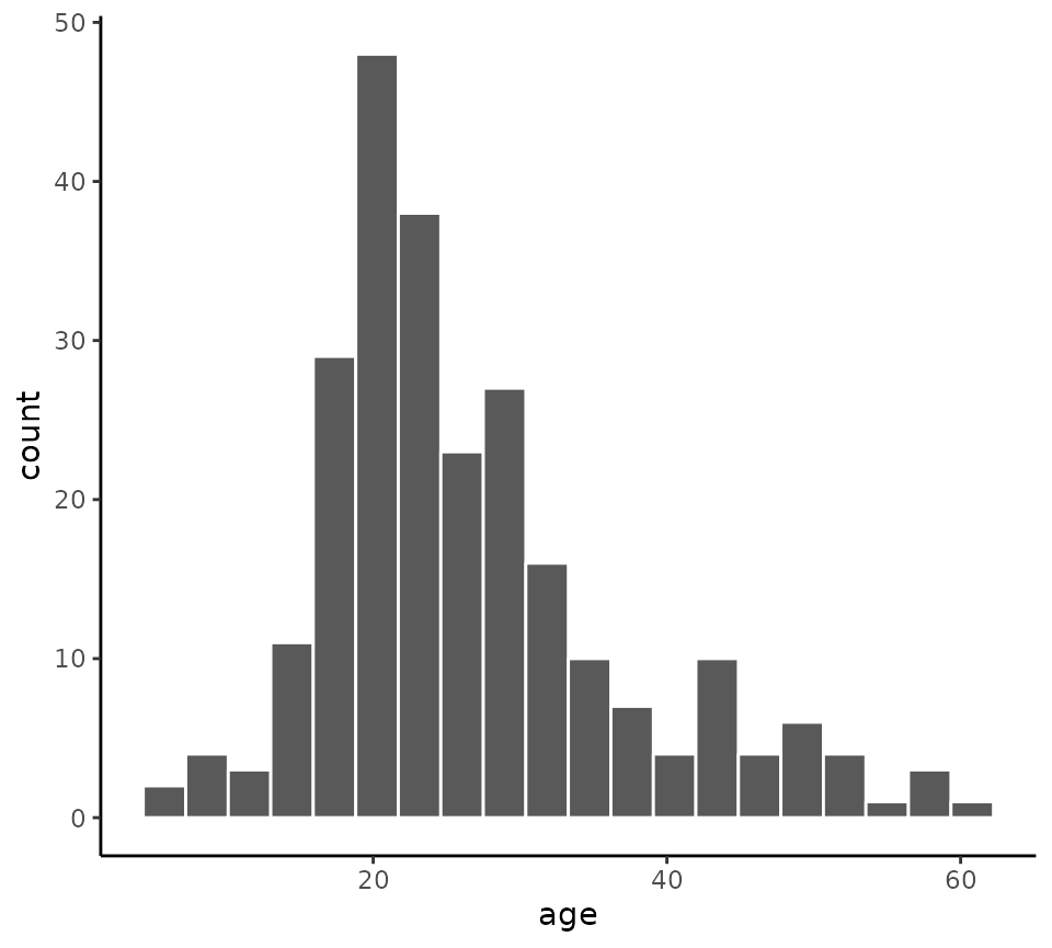
If we use a grouping variable, such as the gender
variable, using the by argument, we obtain a stacked
histogram.
histogram(x = age, data = schizophrenia, by = gender, bins = 20)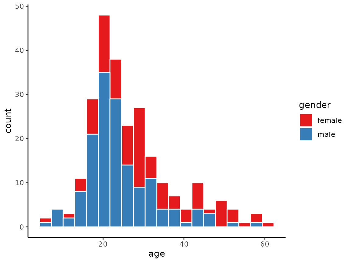
When using by, we can obtain dodged rather than
stacked histograms by setting position = 'dodge' as in the
following example.
histogram(x = age, data = schizophrenia,
          by = gender, bins = 20, position = 'dodge')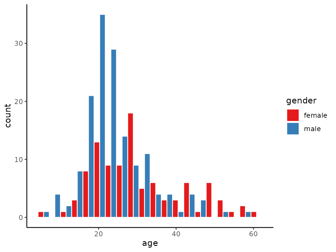
Likewise, we can obtain overlapping histograms by setting
position = 'identity' as in the following example.
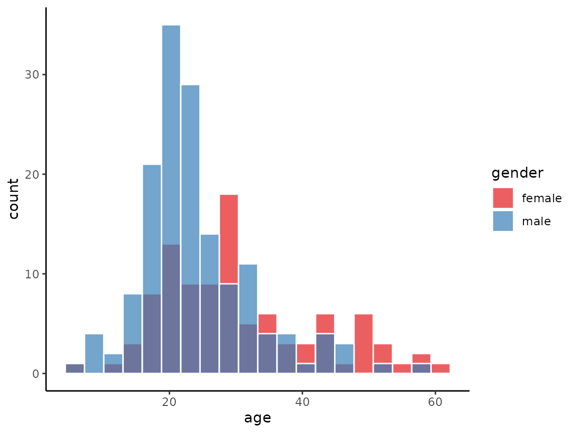
histogram(x = age, data = schizophrenia,
          by = gender, bins = 20, position = 'identity')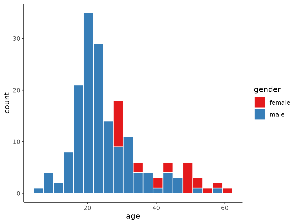
In the case of position = 'identity', it is usually
required to make the bars transparent by setting the alpha
value to be less than 1.0, as in the following example.
histogram(x = age, data = schizophrenia,
          by = gender, bins = 20, position = 'identity', alpha = 0.7)